Official Australian stats1Archive versions of that page here and here. show 17.1% more deaths than expected in 2021-2022. Here’s their main graph – to which I’ve added southern hemisphere seasons.
Initially the ‘with and without Covid’ approach distracted from the key metric: all-cause deaths (red line).
But, once focused I began comparing the red line to the baseline range (light blue zone)… and recalled something my statistics lecturer in university said: the height of the curve is not as important as the total area under it.
So I found myself wondering:
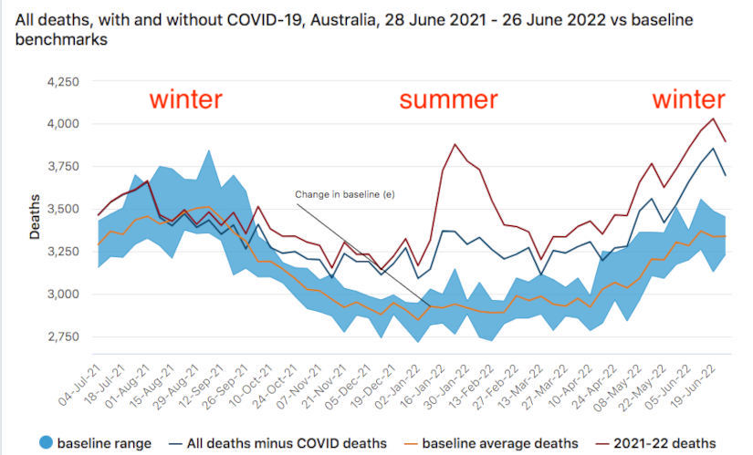
- why did deaths in this particular Australian summer so greatly exceed
- the normal summer range and
- also that of the previous winter?2The chart’s language and design suggests these summer deaths are Covid related. But since when did respiratory viruses do more harm in summer than winter?!
- why are deaths this current winter so much higher than in the previous, less-vaccinated winter?!
- why are Australian all-cause deaths trending upwards and not returning to normal seasonal ranges – just like we see in:
- Rancourt’s USA findings
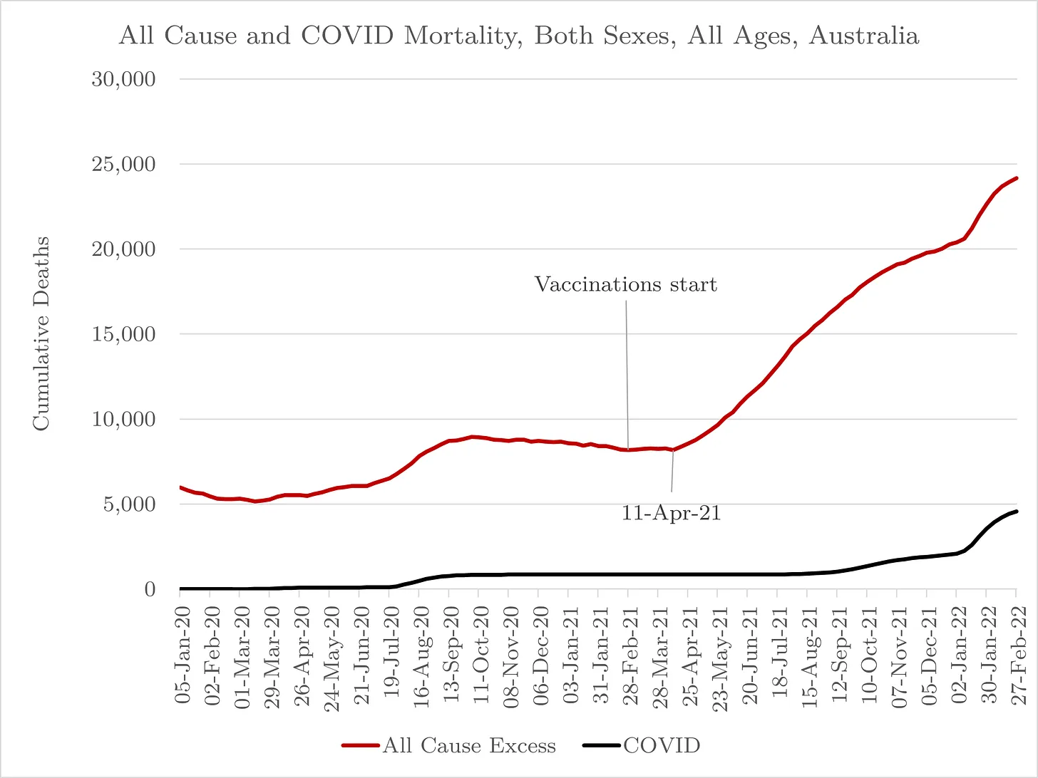
- Engler’s Lombardy analysis3see the final chart I included
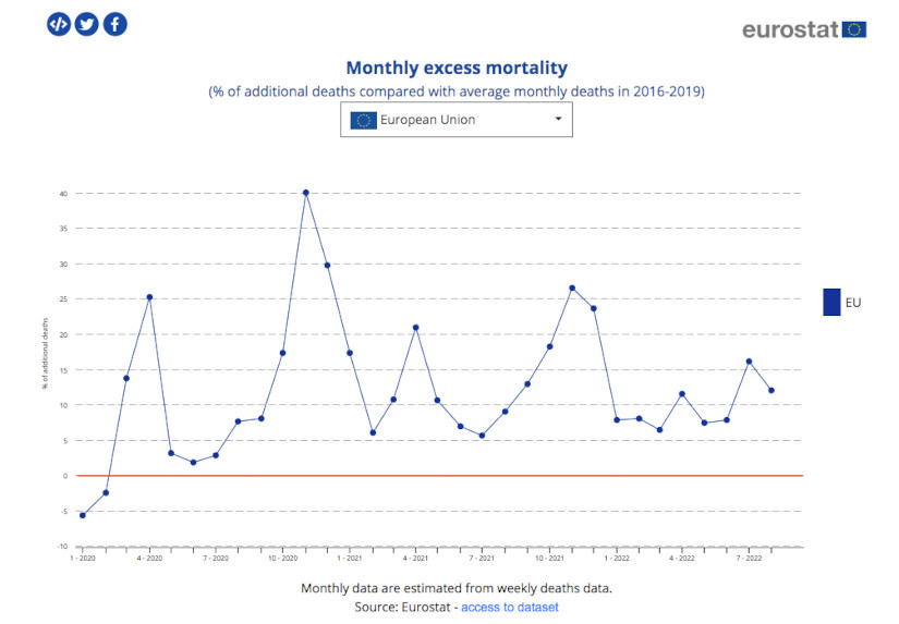
- Euromomo
- Eurostat (I’ve highlighted baseline “0” in their graph)
Who could have seen this coming?
Stats people like Joel Smalley as it happens. In May he posted:
Dr. John Campbell went in to more detail about Australia.
Thanks to checkur6 for highlighting these stats at the end of the latest Young Hearts vid.
- 1
- 2The chart’s language and design suggests these summer deaths are Covid related. But since when did respiratory viruses do more harm in summer than winter?!
- 3see the final chart I included
3 replies on “Australia: all-cause deaths up 17.1%”
[…] Australia: all-cause deaths up 17.1% October 21, 2022 […]
[…] Australia: all-cause deaths up 17.1% October 21, 2022 […]
[…] Australia: all-cause deaths up 17.1% October 21, 2022 […]