There is a lag time of a few months, and it doesn’t show years prior to 2020. But it still helps show official data at a glance.
Select your country (or countries) then mouse-over the dots to reveal that months % figure. As you do, please keep in mind:
- the area ‘under the curve’ (between the graphed line and zero) is as important as the height of a peak
- excess deaths would be expected to rise in Winter and fall in Summer.
You can also view this data in Table, Line, Bar or Map format directly on Eurostat. For example…
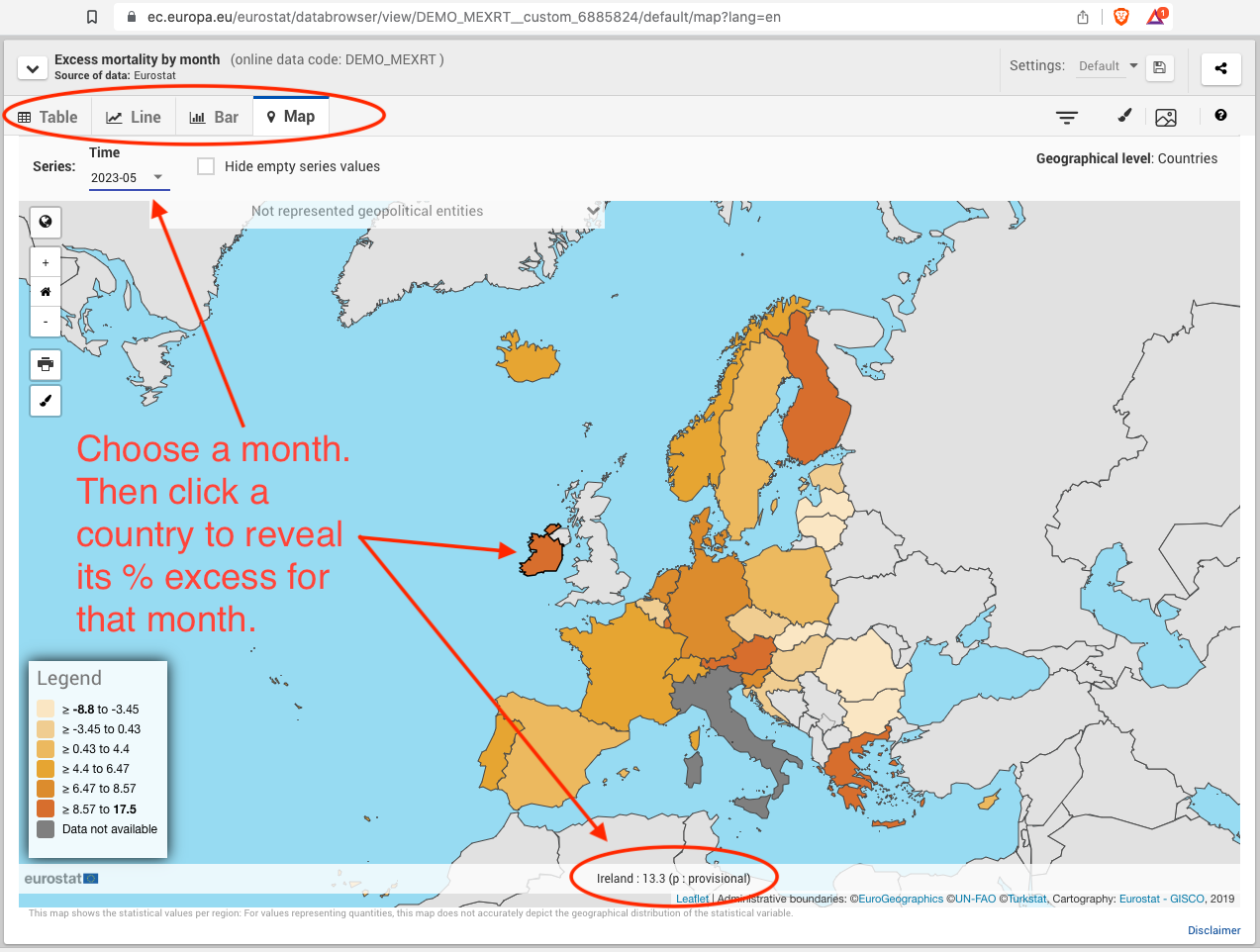
Explore the Eurostat data here.
One reply on “Eurostat Interactive Tool”
[…] about the Eurostat tool here. There’s also a simpler version on Eurostat (click “Excess Mortality” […]