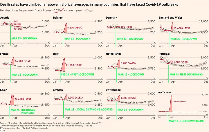
May 2020. John Pospichal was on the ball. Multiple graphs, multiple countries… all telling the same story… leading to obvious, penetrating questions… which politicians and mainstream media were NOT asking.
The extracts below are to encourage you to read Part 1 and Part 2 in full – because the questions make most sense in the context of the graphs.
We now have mortality data for the first few months of 2020 for many countries, and, as you might expect, there were steep increases associated with the beginning of the COVID-19 pandemic in each one.
Surprisingly, however, these increases did not begin before the lockdowns were imposed, but after. Moreover, in almost every case, they began immediately after. Often, mortality numbers were on a downward trend before suddenly reversing course after lockdowns were decreed.
This is an astonishing finding. But before I discuss its full import, and pose some questions to those who still defend the utility of lockdowns, I want to present the data that proves it…

You will notice that only after each country (or city) was locked down did the increases begin. Moreover, they began immediately, and in nearly every case, precipitously.
Now let’s examine the data for a few of these countries and cities in greater detail…
John Pospichal
