Yet another incisive piece from el gato malo.

… if these vaccines were anything like as efficacious as claimed, dosing them into 70%+ of populations (and 90-95% of high risk of death populations) then they would be bending the covid curves like neutrons stars bend spacetime.
the effects would not be subtle…
yet we see no such signals…
the data to do the really rigorous work is being withheld from us and so, like astronomers unable to see celestial bodies, we must infer or refute their existence by watching how things curve as they travel through space and time.
but try as we might to find it, planet “vaccines stop covid deaths” does not seem to exist…
Following, are key charts, phrases and conclusions I’ve picked out. Want more step-by-step detailing? Read the full original on el gato’s substack.
fear not the charts. el gato explains well…

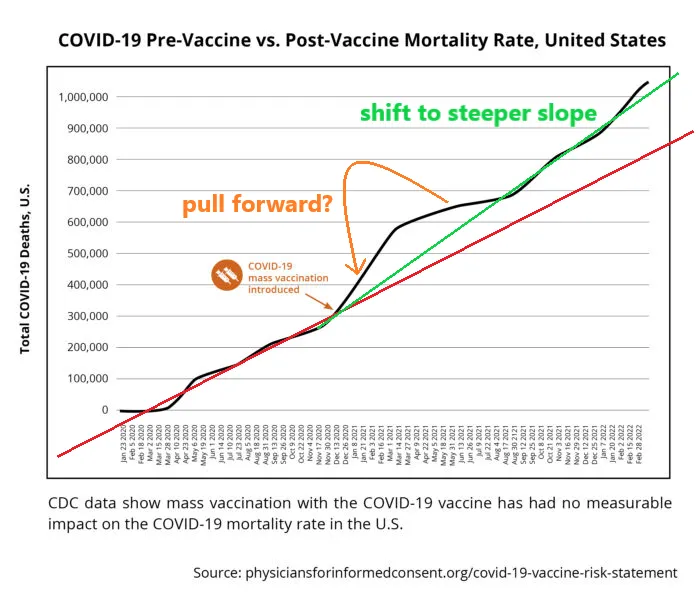
covid deaths had been tracking at a quite linear trajectory. then, right around the commencement of mass vaccination in the US, they accelerated (despite a less deadly variant, more acquired resistance in the population, and the prior cull of high risk groups.)
the curve bent the wrong way.
the red line shows what a continuation at prior rate would have looked like.
the green line shows the durable shift to a new, steeper slope. (more deaths per day)
this is an unexpected and (obviously) unwanted result.
of further concern is the excursion above this slope immediately following vaccines going into broad use where deaths picked up dramatically and then subsided to a lesser rate than even the red line before then resuming their inexorable climb at the new higher rate in the fall of 2021.
note that this precedes the arrival of omicron in the US… despite omicron being the mildest variant yet and even greater rates of acquired resistance and vulnerable cohort depletion)
the “pull forward” marked in orange is of particular worry as it makes it look like the jabs were causing accelerated deaths and burned rapidly through a group then saw fatality subside as the group was depleted. this finds worrying alignment with the well established issue of 14-21 days of serious immune suppression post jab…
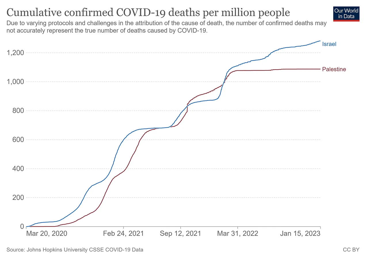
israel vs palestine

covid deaths ended in low vaxx palestine in 2022 yet continue in isreal. this is NOT what one would hope to see. again, the curves bend away from one another in the “wrong” direction.
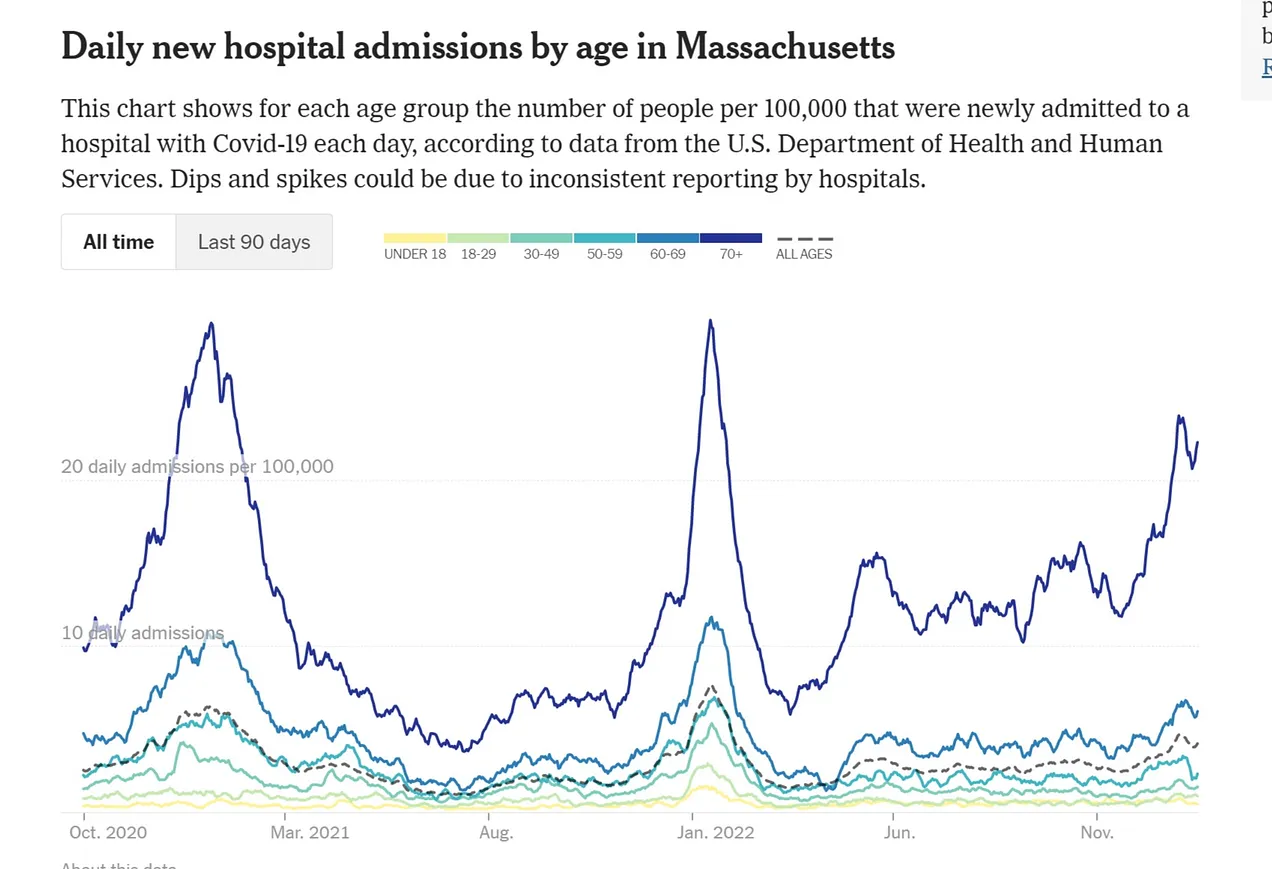
US hospitalization rates
we have also seen hospitalization rates in the US improve least (or even accelerate) among the most vaxxed.

if this is vaccines working, i wonder, what would it take to describe them as failing?
there is just so much pattern here. it makes me suspect that the positive VE1Vaccine Efficacy data from CDC2Center for Disease Control and Prevention, USA and ONS3Office for National Statistics, UK is just GIGO.4‘Garbage In = Garbage Out‘
if VE were anything like 50-90%, [thereby saving millions of lives] we’d be seeing massive curve bends [in the opposite direction] that are simply nowhere in evidence.
el gato malo
- 1Vaccine Efficacy
- 2Center for Disease Control and Prevention, USA
- 3Office for National Statistics, UK
- 4‘Garbage In = Garbage Out‘
