This graph is doing the rounds again.
But most sharing it don’t describe how people can verify it for themselves.
Pity.
Because “that graph is fake” will likely be the first denial strategy the mind of many will deploy.
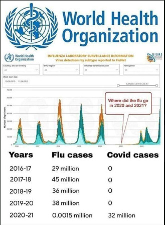
How to show that mind it’s for real:
- Go to the World Health Organization “FluNet Summary” page.
- Click: View FluNet chart for different time periods and geographic regions1Toward bottom of page. Oh, and I’m not sharing a direct link as the URL starts with “app.powerbi.com” and the doubtful mind would likely say “but that’s not a WHO website”. At least if you start them from WHO.int you’ve avoided that hurdle.
- Select your parameters2The settings Show chart > By date and Hide influenza positive specimens (%) are important if you want to reproduce exactly.
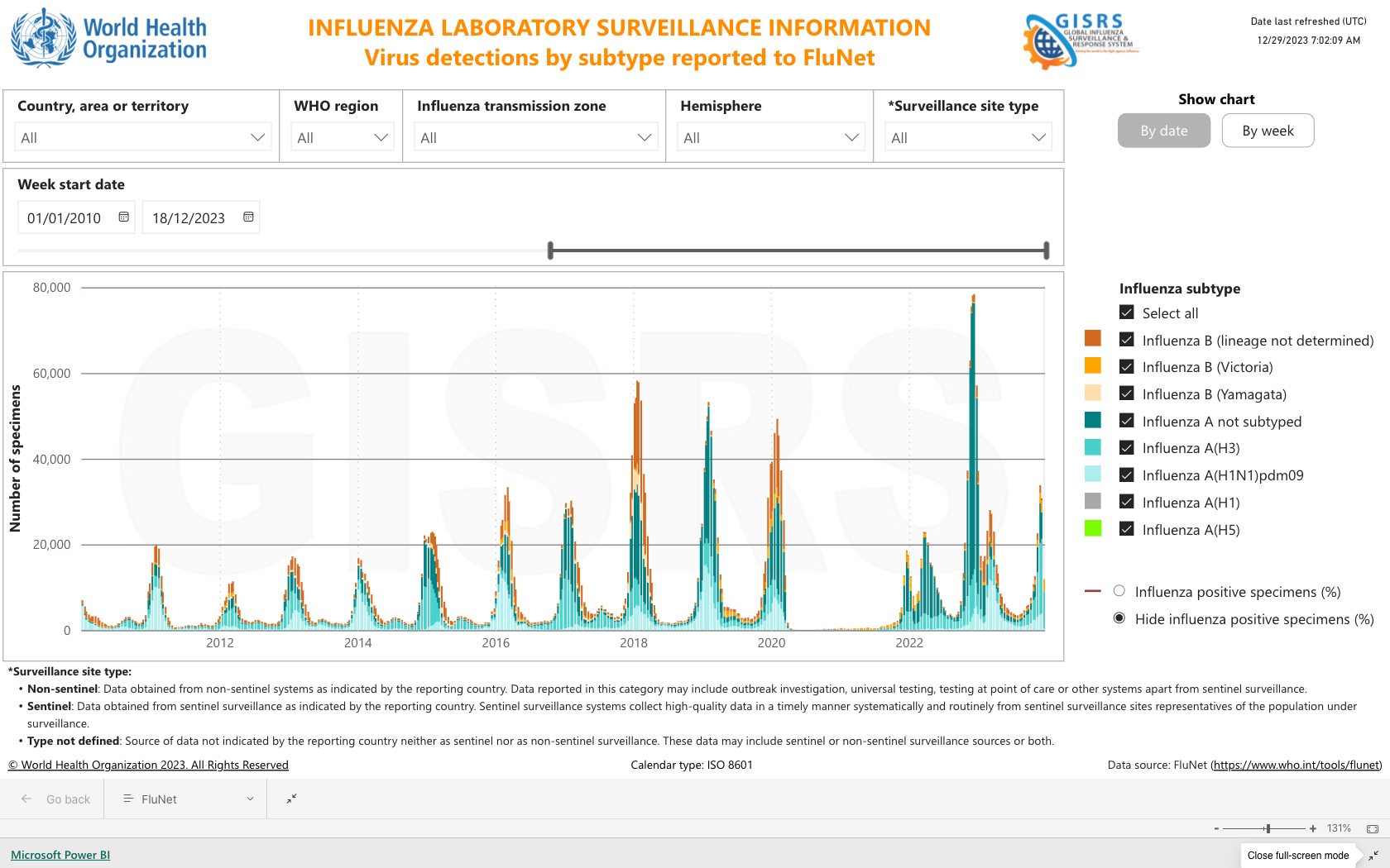
Other useful WHO resources here
For instance, Combined surveillance graphs by country allowed generation of this influenza graph for Ireland (2010-2023).
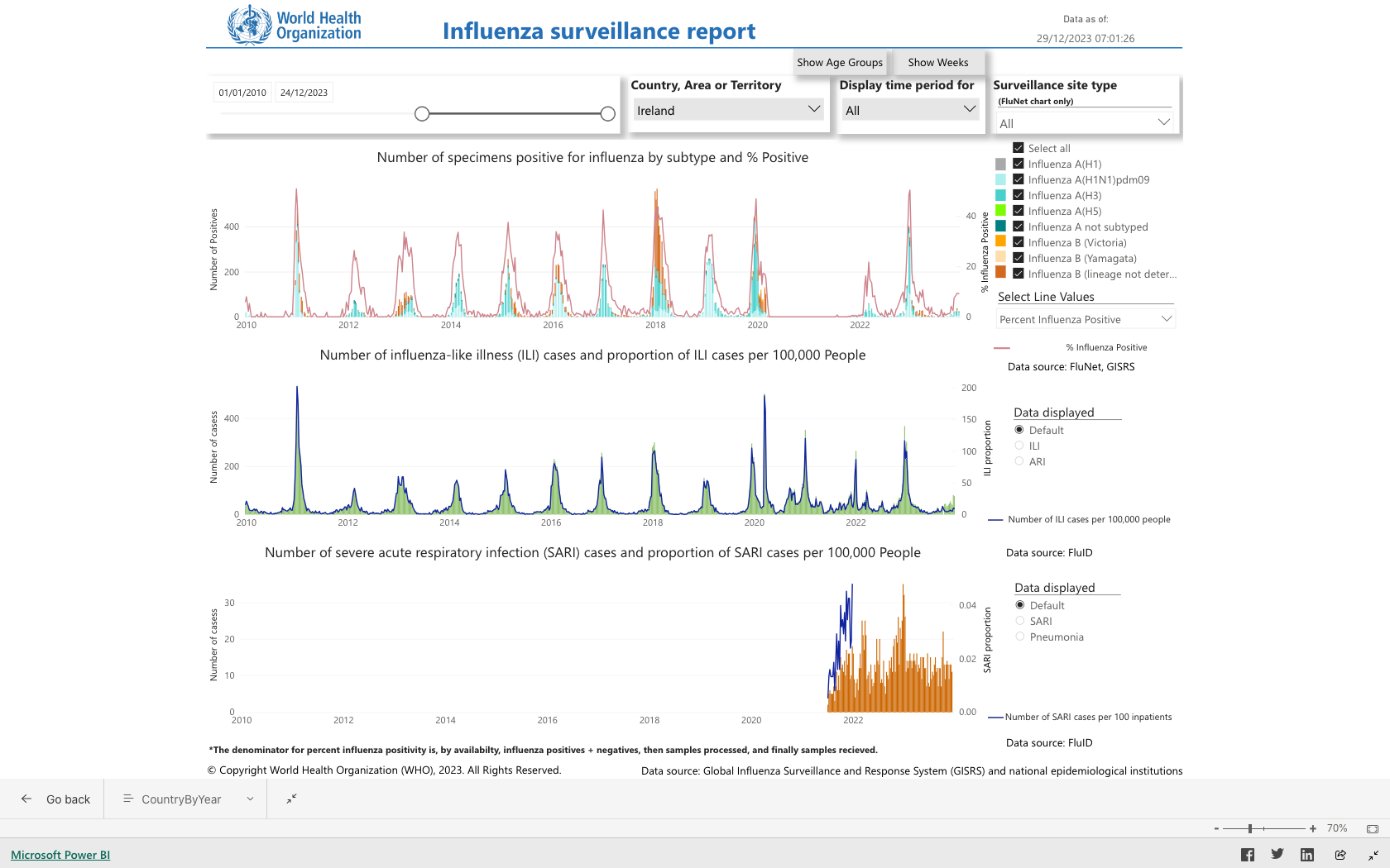
Now, about that Ireland graph. Why…
- … no fuss about all the ‘cases’ in the 2010/2011 Winter season?
- … hasn’t the normal Summer low happened in recent years?
- 1Toward bottom of page. Oh, and I’m not sharing a direct link as the URL starts with “app.powerbi.com” and the doubtful mind would likely say “but that’s not a WHO website”. At least if you start them from WHO.int you’ve avoided that hurdle.
- 2The settings Show chart > By date and Hide influenza positive specimens (%) are important if you want to reproduce exactly.